
Updated Logo
Warrior Element from Ship. Original Ship to Remain as Watermark

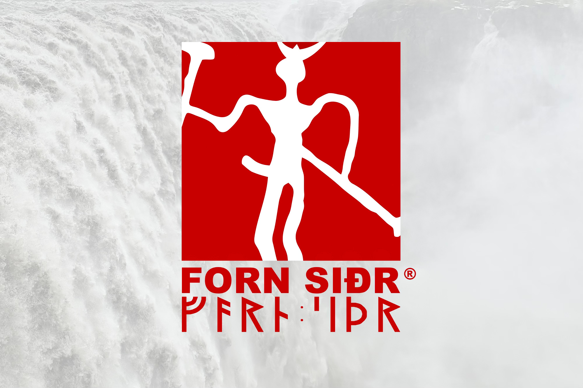
The Forn Siðr logo has been updated and simplified. It now features one of the warriors from the ship (original rock carving/painting from Northern Norway), in white, as a simpler, sharper and bolder symbol, with a brighter red background.
Naturally, the original version of the rock carving/painting has been kept, including the Göndull. This reinforces masculinity, especially at a time when modern society is emasculating men and stigmatizing anything masculine. It also blatantly rejects Christianity and other Abrahamic religions by showing a symbol that has been heavily repressed by the desert cults. The original rock carving/painting design also highlights the primal nature of our belief system. The focus on the individual conveys self-development, nature, innate freedom and the sacred aspect of the male and warrior in Norse culture. The spear and axe is a reminder that Forn Siðr is a warrior belief system. The brighter red is more dynamic and is more in line with that of the Norwegian flag as well as royal Áskunnrættin banner, as well as blood.
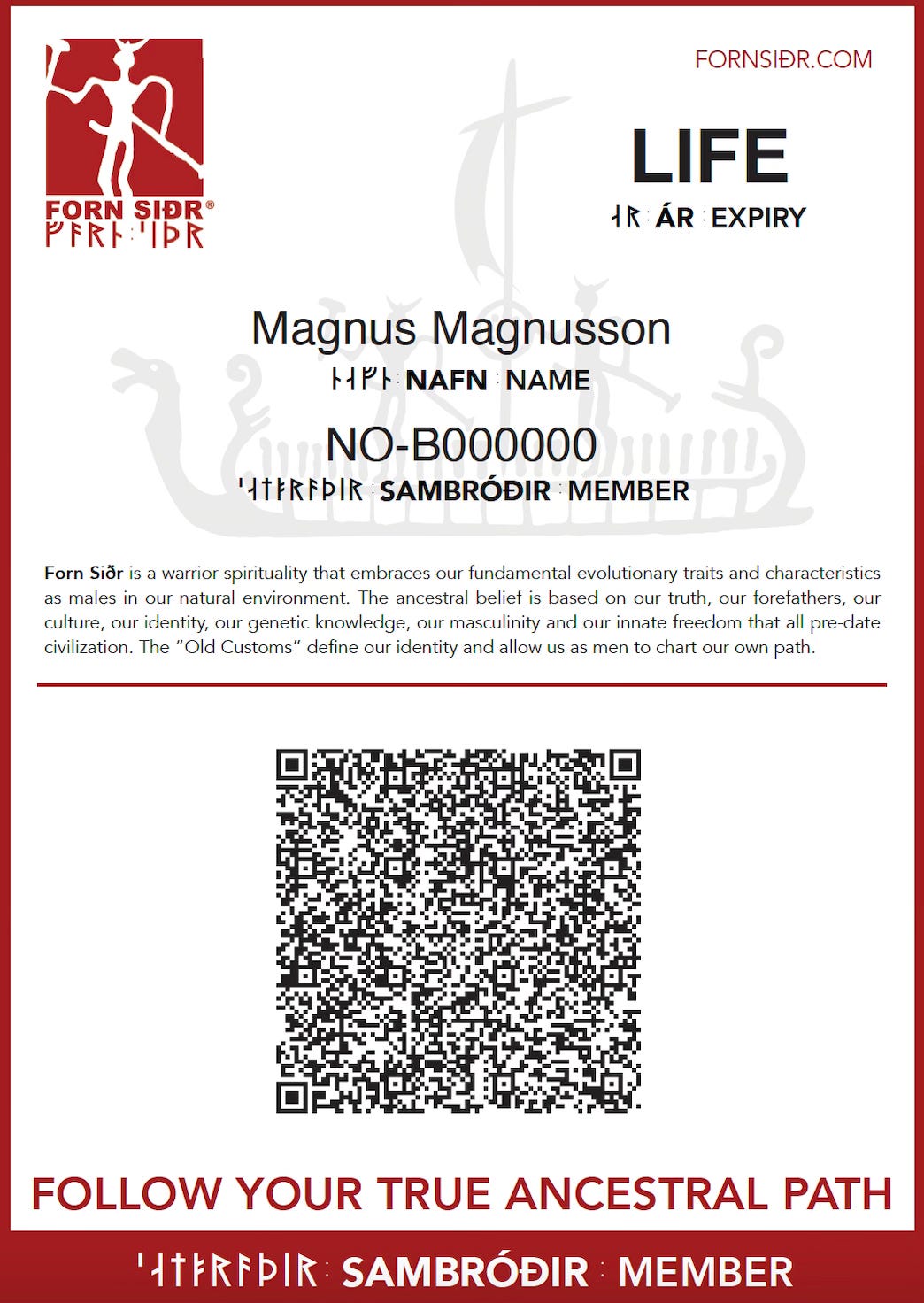
The original ship has been kept as a watermark, including on the updated membership certificates to be issued for membership effective today.
The next generation of patches, laser-cut, will also feature the new design, and so will decals.
New patches are available at https://sonnungr.no/trade/fornsidr-patch.
New decals are available at https://sonnungr.no/trade/fornsidr-decal.